Page Removal & Deactivation (Post-Launch) outlines the required process for retiring live pages without deleting them. Pages must be renamed, removed from navigation, set to draft, moved within the root structure, and redirected to prevent 404 errors and protect SEO integrity.
During site build, unused template pages must be moved to XTRA Pages and unpublished or deleted if unsupported. FAQs and Request Form pages must be set to Draft to prevent indexing. SAPs must be nested under Serving Area. The live page tree should reflect only intentional, approved structure.
Every Hibu One Smart Site includes a Social Image (Open Graph or OG image) that controls how links appear when shared on social media and messaging apps. Images must meet size and ratio standards and clearly represent the business for consistent, professional previews.
Text-heavy promotional images often fail on mobile when scaled from desktop widths. Landscape graphics become unreadable, and portrait layouts still reduce clarity. Mobile-friendly versions are required for hero use; otherwise, images must be hidden or placed in supporting sections.
Defines how BBB logos, text references, and accreditation seals may be used on Hibu One Smart Sites. Covers verified accreditation requirements, allowed placements, linking rules, use of dynamic seal code, and restrictions to prevent misleading endorsement or ratings.
Fair Use Policy — guidelines that define reasonable build limits for content included in a standard Hibu One Smart Site. Covers maximum quantities for inventory items, photo galleries, PDFs, and custom forms, along with image quality expectations and transparency requirements to ensure fairness, consistency, and high v
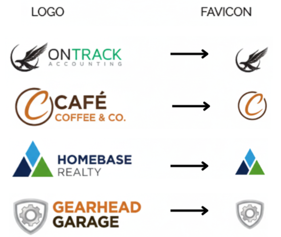
Favicons and Open Graph images help strengthen a site’s branding and visibility. Each Hibu One Smart Site includes a favicon by default and a standard OG image for social sharing. Clients can supply their own icons or images if they meet size and format requirements.
Images uploaded to Hibu One Smart Sites are automatically optimized by Duda to improve load speed, performance, and visual quality across devices. This includes resizing, compression, modern format delivery, and device-specific optimization, with no manual setup required.
Badges and accreditation logos are placed in the footer to maintain a consistent, professional look. Each must include alt text, use a uniform size, and meet quality standards. If a logo or badge is missing or low-quality, the best available version is used, or a note is added if unavailable.
The Instagram Photo Gallery Feed displays up to 100 recent images from a connected Professional Instagram account. It updates automatically and supports image posts only. Designed for active business accounts, it keeps site content fresh and visually engaging without manual uploads.
The Photo Gallery widget displays client-supplied images to highlight real examples of work, products, or services. Each gallery supports titles, descriptions, and alt text for SEO and accessibility. Galleries can include up to 100 images and may link to a connected Professional Instagram account for automatic updates.
Hero images set the first impression for each page, confirming to visitors they’re in the right place. Designers should choose high-quality, uncluttered images that keep text and calls to action readable.
Hibu will upload and optimize up to 1,000 images per site, including galleries, section visuals, and brand assets. All images must meet quality standards, stay under 50MB, and support clear display. Hibu renames all files and applies descriptive alt text.
Hibu features one high-quality business logo in the site header to ensure clear branding across desktop, tablet, and mobile. PNG is preferred, with SVG and JPEG accepted. Logos must be clean, readable, and properly optimized; animated or low-resolution files are not supported.
Legacy images from older, narrow layouts may not scale well on modern designs. Low-quality assets may be excluded from hero areas, reused in secondary sections or galleries, or replaced with updated images. Any exclusions must be documented and communicated clearly to the client.
Image labels and image file names serve different purposes. Labels are internal, human-readable identifiers used in Duda to find and reuse images, while file names and alt text support SEO and accessibility. Labels should describe image use, not follow file-naming rules.
Defines how image and file assets are renamed in Hibu One to improve organization and usability. Filenames must lead with asset context, place the business name last, follow formatting standards, and align with Media Manager behavior for easier scanning and selection.
Background videos may appear on home pages and category (CAT) layouts. Videos must use subtle, landscape footage that supports hero text and site performance.
Hibu One Smart Sites support uploaded and embedded videos to highlight services, demonstrate expertise, and improve engagement. Up to 20 videos may be added per site, including YouTube, Vimeo, and Dailymotion embeds. Videos must be web-ready, properly sourced, and optimized for performance.
Hibu One Smart Sites look best with properly sized images. Use wide hero images (1980–2560px), content images (1200–1600px), and small thumbnails (150–300px). Pixel size matters more than DPI. JPG or PNG files are recommended.
Alt text describes images for screen readers, supports accessibility, and provides helpful context for search engines. Properly written alt text is clear, specific, non-spammy, and applied consistently across images, logos, and UI elements to ensure usability, compliance, and better indexing.
Designers may use a client’s logo before authorization is signed only when there is clear public evidence that the client owns and actively uses that logo. Designers must document the basis for the assumption every time.