Pages & Navigation

By Hibu February 7, 2026
Clarifies the differences between Catalog Overview Pages and Inventory Pages, including when to use each, how they work together, and the shared 50-card site limit. Helps teams choose the right structure and avoid misusing categories or item listings.
By Hibu February 1, 2026
Password-protected pages restrict access using a single shared password and are available by request. These pages count toward total page limits, must be set to no index, do not support unique logins, and cannot be applied to dynamic or anchored pages.
By Hibu February 1, 2026
Page types define how a site’s content is structured and accessed through navigation tiers. Tier 1 holds primary pages like Home, Category Landing Pages, key Core, and Utility pages. Tier 2 contains supporting Core or Utility subpages.
By Hibu February 1, 2026
Beginning December 3, 2025, all new Hibu One Smart Sites use the dynamic Mega Menu widget, which reduces manual setup, enforces correct page structure, and supports up to five balanced columns. Older sites continue to use the legacy version, which requires manual curation of CATs, children, and standalone pages.
By Hibu February 1, 2026
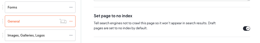
A hidden page is available only by direct URL and not linked in site navigation. These pages count toward the site’s total page count and must include full content and design. When hidden, they’re set to “no index” so they don’t appear in search results but remain part of the sitemap.
By Hibu February 1, 2026
Defines how Hibu One Smart Sites handle inventory-style content, including page structure, item limits, naming rules, descriptions, images, CTAs, and when to use a catalog overview page instead of full inventory.
By Hibu February 1, 2026
Defines what content belongs on Homepage and Category Landing Pages to support conversion, clarity, and AI discovery. Emphasizes company-level messaging, trust signals, and intentional placement while keeping service-specific detail on dedicated pages.
Header navigation structure, design standards, and accessibility requirements for Hibu One Smart Sit
By Hibu February 1, 2026
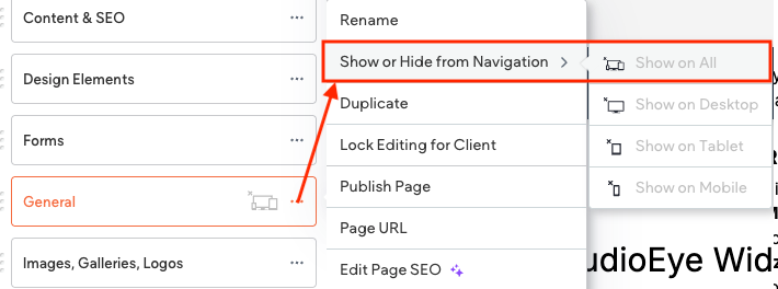
The Header Navigation is the main menu bar that guides visitors to a site’s key pages. Built with the Navigation Links widget, it follows Hibu’s global design and accessibility standards for clarity and consistency.
By Hibu February 1, 2026
Restaurant menus must use a single Menu Page with anchored sections for each category. The homepage serves as the category landing page with preview blocks linking to anchors. Unique menu pages can be built on request, but are not recommended for UX or navigation.
By Hibu February 1, 2026
A Catalog Overview Page is used when a client’s product line exceeds 50 items. It provides a high-level preview—intro paragraph, up to four sample images, optional labels, and one CTA linking to the full catalog PDF.

Header Navigation

Definition

The Header Navigation is the main menu bar displayed above the hero section on desktop. It provides access to the site’s primary pages and is built using the Navigation Links widget, which is automatically added to the site header when a new site is created.

By default, it displays all pages marked “Show in Navigation” in the Pages panel.
Design, structure, and accessibility are governed by
Hibu global standards to ensure clarity, consistency, and a cohesive user experience across all Hibu One Smart Sites.

Design & Accessibility

The Header Navigation consists of:

  • Global Navigation (Tier 1)
  • Sub-Navigation (Tier 2)

All design and accessibility standards apply equally to both tiers unless noted.

  • Font type, size, color, and contrast must meet AA-level readability standards.
  • The Contrast Checker in the editor must be used to verify legibility in all states.
  • Navigation styles (on/off/hover) and behaviors are standardized at the template level and must not be modified unless explicitly approved after the first proof.

Typography & Legibility (Global Rules)


Font Type

  • Designers may select a font that enhances legibility or aligns with brand style. Use clean, professional, web-safe typefaces that complement the site design.


Font Weight

  • Bolding may be used to improve readability or hierarchy but must be applied consistently across all states (On, Off, Hover) and navigation levels.
  • Mixing bold and non-bold states creates visual instability and is not permitted.


Font Color

  • Default text color: white (#FFFFFF)
  • If contrast is insufficient against Theme Color 10 – Navigation BG, use black (#000000) or another dark tone for visibility.
  • Adjustments must be made at the theme level to ensure global consistency.


Text Transform

  • Text case (Title Case or Uppercase) may be adjusted to match the brand style or enhance legibility.
  • Uppercase may be used for clean, modern aesthetics but must remain consistent across all navigation levels.
  • Mixing Title Case and Uppercase within the same site is not permitted.


Legibility Priority

  • Accessibility and legibility always take precedence over style. All navigation text must pass AA-level contrast compliance and remain readable across devices and backgrounds.

Navigation States

Off-State (Default / Idle)

  • Text color: Theme Color 11 – Navigation Text
  • Background: Theme Color 10 – Navigation BG
  • No color transitions or animations
  • Underline appears only beneath the active link
  • Provides a clean, stable appearance


Legibility Exception:

  • Designers may adjust font color or weight if background contrast reduces readability.

On-State (Active / Current Page)

  • Persistent white underline indicates the current page
  • Text color remains consistent with Off-State
  • Underline thickness and offset are defined at the template level and must not be modified

Hover-State (Rollover)

  • Text color remains white
  • Underline appears or brightens smoothly (no shift or animation)
  • No background color change
  • Sub-navigation only: Inverts colors for hover — background becomes white (#FFFFFF), and text adopts Theme Color 10

Sub-Navigation (Dropdown Behavior)

  • Background matches Theme Color 10 – Navigation BG
  • Hover and active states follow the inverse color rule for clear visual feedback
  • Sub-navigation text should be slightly smaller (1–2 points) than global navigation text
  • Maintain consistent spacing and legibility at smaller sizes


General Behavior Rules

  • Dropdown width, spacing, and padding are standardized at the template level and should not be altered.
  • The dropdown position aligns directly below its parent global link, maintaining even spacing across all sub-menus.
  • Sub-navigation should open cleanly and close automatically when focus shifts elsewhere, ensuring a seamless user experience.

Hidden Pages

Definition

A hidden page is a page that is available by request but not attached to the site’s global navigation. It can be accessed directly via URL and is included in the site’s total page count.


Rules and Guidelines

  • Hidden pages must contain complete content and design (no placeholders).
  • Hidden pages are available only by request and do not appear in global navigation menus.
  • To fully hide a page, the Hibu Team must:
  • Hide the page on all devices.
  • Set the page to no index to prevent it from appearing in search engine results.
  • Hidden pages are included in the site’s total page count.
  • A unique title tag must be included.
  • A meta description is optional and not required.


Required Build Process

To properly hide a page:

  • In the page list, click the three vertical dots to the right of the page name.
  • Select Show or Hide from Navigation, then choose Hide from All.
  • Once hidden, a grey “hidden page” icon will appear next to the page name.
  • Again, click the three vertical dots and select Edit Page SEO.
  • Under SEO settings, toggle Set page to no index.
  • This ensures the page will not appear in search engine results, even though it still exists in the sitemap.xml file.

Mega Menu Navigation

Definition

A Mega Menu is an expanded desktop-only navigation layout used when a site has a large number of Tier 1 pages, typically organized into categories. It displays multi-column navigation in a structured, balanced format.


When to Use

  • Use a Mega Menu only if the site includes three or more Category Landing Pages (CATs).
  • Each CAT links to one or more related service or core pages.
  • Fewer than three CATs = use standard dropdown navigation.
  • The Mega Menu supports up to four columns. Unused columns must be removed for visual balance.

Structure & Content Rules

  • CATs and subpages should be ordered alphabetically when possible but may be rearranged for visual balance.
  • A total of 11 CATs + standalone core pages is the maximum allowed.
  • If the number of pages exceeds this limit, the writer or designer must consolidate or reorganize content.
  • Mega Menus are desktop-only; they revert to standard dropdowns on mobile.


Styling Rules

  • Colors are defined by theme:
  • Theme Color 10 – Navigation BG
  • Theme Color 11 – Navigation Text
  • Hover states are fixed and cannot be altered.
  • Gradient or image backgrounds are not permitted.
  • No additional widgets (e.g., forms, coupons, callouts) may be placed inside the Mega Menu.
  • Rollover behavior mirrors the sub-navigation hover state (white background / Navigation BG text).

Editing & Management

  • To edit navigation links or Mega Menu items, open the Navigation Links widget and select Manage Links.
  • To open a Mega Menu section, hover over the Navigation widget and click the section or link when the Mega Menu appears.
  • Deleting a navigation link or switching header presets will delete its associated Mega Menu section.

Page Types and Navigation Tiers

Definition

Navigation tiers define how pages are organized within a site’s global and local navigation. Tiers determine visibility, hierarchy, and how users move between core services, utility functions, and supporting content.

Page Type Typical Nav Tier(s) Primary Function Notes & Relationships
Home Page Tier 1 (Global) Serves as the main entry point; routes to primary CLPs or high-value Utility/Core pages. Always Tier 1
Category Landing Page (CAT) Tier 1 (Global) Acts as a “parent” hub for a related set of Core Pages. Summarizes a service category or offering. Typically Tier 1, but can also be a Tier 2 nested CAT if it sits under a broader CAT
Core Page Tier 2 (Sub-Nav) or Tier 1 (Global) Provides detailed, actionable content about a specific service, topic, or offering. Includes conversion CTAs. Normally Tier 2 under a CAT, but may exist independently as Tier 1 when it’s strategically important or not part of any category.
Utility Page Tier 1 (Global) or Tier 2 (Sub-nav under another Utility Page) Supports brand trust, conversions, and secondary tasks such as learning, engagement, or contacting. Flexible: • Tier 1 when it represents a key business or engagement goal (About, Contact, Gallery). • Tier 2 when nested under another Utility Page (FAQs under About). • Contact Us is always Tier 1 — never nested.
Nested CAT (CAT-as-Child) Tier 2 (Sub-Nav) Functions as a sub-hub beneath a parent CLP when a service group needs its own overview. Behaves like a CAT but inherits hierarchy and visual consistency from the parent.
Mega Menu Tier 1 (Global) 3+ CATs (and their Core Pages) + Tier 1 Core Page Introduced only when 3+ CLPs exist. Supports breadth-first exploration and fast scanning.

Principles and Logic


Tier Assignment

  • Tier 1 (Global Navigation)
  • Contains the site’s most important entry points: Home, CATs, high-value Core Pages, and major Utility Pages.
  • Core Pages may appear here only if they are standalone (not tied to a CAT).
  • Utility Pages (e.g., About, Contact, Gallery, Finance)
  • Contact Us / Locations is always Tier 1 — it is a universal conversion path, never subordinate.
  • Tier 2 (Local / Sub-Navigation)
  • Used for subtopics
  • Core Pages typically sit under CATs.
  • Utility Pages such as FAQs, Reviews, or Blog may be placed here if structured under another Utility Page (e.g., under About).
  • Nested CATs appear here when a broader CAT requires further subdivision.


Utility Page Flexibility

  • Utility Pages can be placed in Tier 1 or Tier 2 depending on site narrative and business priorities:
  • About Us → Tier 1, with Tier 2 sub-items like FAQs, Reviews, Blog, Finance (optional).
  • Gallery → Tier 1, as visual proof and portfolio.
  • Finance → Tier 1 if lead-gen focused; Tier 2 under About if part of company story.
  • Contact Us / Locations → Always Tier 1.


Category, Core, and Utility Relationships

  • Every Core Page either belongs to a CAT (Tier 2) or stands alone as a Tier 1 Core.
  • Every CAT functions as a parent:
  • May contain Core Pages as children, or
  • Act as a child CAT under a broader CAT (nested).
  • Utility Pages remain outside the category/core hierarchy but can host their own Tier 2 subpages.

Password-Protected Pages

Definition

A password-protected page is a page that requires a user to enter a password before viewing its content. This option is available by request and is best suited for restricting access to specific resources (e.g., downloads or private content).


Rules and Guidelines

  • Password-protected pages are available upon request.
  • Each page is protected with a single password entered by the client. Unique logins are not supported.
  • Password-protected pages are included in the site’s total page count.
  • Password-protected pages must be set to no index so they do not appear in search engine results.
  • Dynamic and anchored pages cannot be password-protected.


Example

Single Page Options

Definition

Single Page Management allows individual pages of a Hibu One Smart Site to be published, drafted, or customized without affecting the entire site. This is useful for making targeted updates, hiding pages, or controlling how a page appears to search engines and users.


Page Settings

Each page has its own settings, including:

  • Rename (editor display name only, does not change URL).
  • Hide in navigation (page remains live by direct URL but is hidden from menus).
  • Duplicate (create an exact copy).
  • Custom URL (edit the page slug).
  • SEO settings (unique title and description recommended for best performance).
  • Access control (set password protection).
  • Delete (remove the page entirely).
  • Set as draft: A drafted page is removed from the live site and search results. It can be reinstated later.
  • Homepages, external link pages, and folders cannot be drafted.


SEO Options

  • Each page should have a unique title tag and meta description for search visibility.
  • No Index must be applied to remove a page from search results (e.g., thank-you pages, search/PPC pages, promotion pages, hidden page, password protected pages, etc.).
  • Draft pages are automatically set to no index.


Open Graph Image (Social Sharing)

  • A page-specific Open Graph image can override the site-wide default.
  • This image will appear when a page link is shared on Facebook, LinkedIn, or iMessage.
  • Recommended size: 1200 × 630px.
  • Example: A restaurant may set a photo of its signature dish to appear when its Menu page is shared.

URL Redirects - 301 Redirects

Definition

A 301 redirect is a permanent redirect that sends both users and search engines from one URL to another. It ensures visitors reach the correct page and helps search engines transfer most of the original page’s ranking power (about 90–99%) to the new page.


Hibu One Smart Site Rules

  • Hibu will set up 301 redirects when moving from an old Hibu site or a third-party website to a new Hibu One Smart Site.
  • Redirects are only applied when the old site and the new site use the same domain (example:  foo.com   → foo.com ). Redirects cannot point from one domain to another (example:  foo.net   →  foo.com ).
  • Wherever possible, old pages are redirected to the most relevant new page. For example, an old page at  /roofing may redirect to the new page  /roofing-services . If no equivalent page exists, the redirect will point to the homepage.

Headline

This is paragraph text. Click it or hit the Manage Text button to change the font, color, size, format, and more. To set up site-wide paragraph and title styles, go to Site Theme.