FAQs
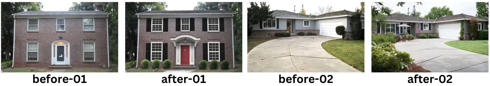
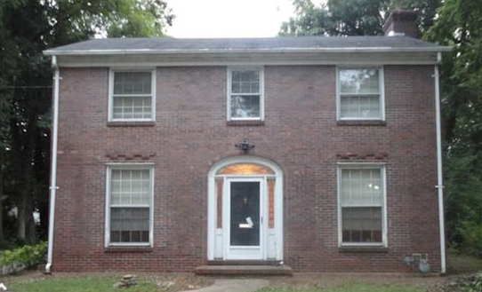
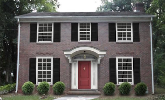
Before / After Widget
Definition
The Before/After widget displays two images in a slider for side-by-side visual comparison. It’s most effective for showcasing clear transformations (e.g., lawn care, roofing, remodeling).
Best Use Cases
- Home services or contractors showing project results.
- Side-by-side transformations that highlight quality of work.
- Any scenario where a simple visual comparison strengthens credibility.
Limitations
- Avoid if images are taken from different angles, distances, or lighting conditions — mismatches will distract rather than impress.
- Avoid if images already contain “Before” / “After” text or other embedded labels (creates visual clutter).
- Not recommended if one or both images are low resolution or heavily pixelated.
Setup & Naming Conventions
- Add the widget from Widgets → Before & After, then drag onto the page.
- In the Content Editor:
- Click + Image to upload/select your before and after images.
- Always place “Before” on the left and “After” on the right.
- For multiple sets, use a simple naming convention (e.g., before-01/after-01, before-02/after-02, etc.) for organizational clarity.
- Add alt text for each image (e.g., “residential roof replacement – before” / “residential roof replacement – after”). AI alt text may be used but should be refined if needed.
- In the Design Editor:
- Customize images under Images & Slider.
- Ensure displayed size never exceeds the actual image resolution.
- Keep before and after images the same size (avoid distortion).
- Labels: Use default “Before” and “After” labels unless otherwise instructed. You may hide labels if not needed.
Key Notes
- If images are well-matched and free of embedded text, designers are free to use this widget to create engaging, interactive comparisons.
- When used correctly, this widget provides strong proof of work and supports lead conversion.
Buttons
Definition
Buttons are a primary way users interact with a Hibu One Smart Site. They guide visitors toward key actions (e.g., contacting a business, requesting a quote, or, simply, learning more). Button style, size, and text are defined by design standards but must always remain clear, accessible, and consistent.
Design & Accessibility
- Use the Contrast Checker in the editor to ensure text meets accessibility standards.
- Aim for green check (AA or AAA) compliance.
- Strong contrast improves readability, accessibility, and conversions.
Color & Theme Rules
- Primary and secondary button colors — including both default and hover states — are linked to theme color placeholders:
-
18 – Button Primary -
19 – Button Secondary - By design, the secondary button’s on/hover colors are the inverse of the primary button for visual balance and consistency.
- Font color for all buttons is linked to
2 – Whiteby default.
Adjusting Button Colors
- Designers may update button primary, secondary, or font color values only at the theme level — never inline on the page.
- Inline color edits prevent future theme-level updates from applying correctly and create maintenance issues.
- Any changes should maintain strong color contrast for readability.
- When customizing, the secondary button should typically remain the opposite of the primary to preserve hierarchy and consistency.
Borders & Effects
- Button borders are off by default.
- If a border is needed for design clarity, set the border width to 1px on both primary and secondary buttons.
- By default, this adds a 1px white border in both the on and hover states.
- Gradients on buttons are strictly prohibited. Flat color designs support clarity, contrast, and consistency across all devices.
Corner Radius (Button Roundness)
Research consistently shows that rounded buttons outperform sharp-cornered ones in click-through rates. Rounded shapes are perceived as more friendly and approachable, encouraging user interaction — whereas sharp edges can feel formal or even intimidating.
- Default: Corner radius is set to 10 px.
- Increase roundness (e.g., 20–30 px): Only if the brand style calls for softer, friendlier shapes — for example, wellness, childcare, or community-focused businesses.
- Remove roundness (0 px): Only if the brand identity or design aesthetic demands a sharper, more structured look — for example, law firms, financial institutions, or industrial services.
- Button shadow: Off by default. Use extreme caution if enabling shadows, as they may render poorly on colored or textured backgrounds and can reduce accessibility.
Button Text Best Practices
- In most cases, “Learn More” is the right choice. It’s simple, expected, and works well across most copy blocks and callouts.
- In some cases, however, a more specific, action-oriented call to action fits better. Examples include:
- Menu: “View Menu”
- Event: “Register Now”
- Estimate: “Request Estimate”
- Careers: “View Openings”
- Blog: “Read Article”
- Download: “Download Guide”
- Use the “I want to…” test when deciding: complete the phrase from the visitor’s perspective.
- Example: If the button text is “Request Estimate,” the user is essentially saying, “I want to request an estimate.”
- This keeps labels user-focused and action-oriented.
Countdown Widget
Definition
The Countdown widget displays a real-time timer that counts down to a specific date and time. It is used to build interest, create urgency, and encourage action for upcoming events, promotions, or launches.
Hibu One Smart Site Rules
- The widget is best suited for seasonal or one-time future events (e.g., sales, product launches, grand openings).
- It is not suitable for recurring events (e.g., weekly specials or happy hours) because it does not automatically restart.
- The widget only counts down; it does not count up.
- The widget will only be added after the first proof or once the site is live.
- Placement is limited to the content body of the site (between the header and footer).
- A designed section is available for Hibu builds to add the countdown widget.
- A custom “time’s up” message may be displayed when the countdown ends.
- Once the timer runs down, the
countdown placeholder remains in place and does not disappear automatically. The client (or their Hibu representative) must request removal. Hibu will not proactively remove expired countdowns.
Dynamic Rows
Definition
Dynamic Rows (also called InSites or Personalization) were previously used to display announcements or promotions that changed dynamically. On Hibu One Smart Sites, they are no longer supported because they slowed sites down, caused layout shifts, and hurt SEO performance.
Hibu One Smart Site Rules
- Hibu One Smart Sites do not use Dynamic Rows or InSites.
- All announcements, promotions, or business updates are handled through a static Alert Banner
- Alert Banners are placed at the top of the homepage.
- They are styled to match the site’s branding.
- They load quickly and do not harm site speed, SEO, or user experience.
- Banner guidelines:
- Text should be short (1–2 lines).
- Banners cannot include scripts, auto-updating content, or custom HTML.
- All updates must be handled through Hibu.

Hero (Standard, Superhero & Thin Heroes)
The
hero is the large visual and message area at the top of a webpage — the first element visitors see before scrolling.
In a
Hibu One Smart Site, heroes appear only on the
homepage,
category landing pages (CATs), and
core service pages.
Each hero sits above the fold, directly beneath the header and navigation bar, and establishes the site’s first impression. It combines a high-quality image, clear headline (H1), geographic reference, motivating factors, and a primary call-to-action (CTA) or form. Together, these elements confirm that visitors have arrived on the right page and encourage them to stay and act.
Standard Hero
- Used on the homepage, category landing pages (CATs), and core service pages.
- Occupies the full width of the page and displays a static, high-quality background image. Hibu One SmartSites do not support or permit hero videos, sliders, or animated content of any kind.
- Includes a headline (H1), geo, motivating factors, one or more CTA buttons such as phone, Visit Us, or Request Estimate, and depending of the business, the open/closed hours widget
- May also include a button linking to a third-party site (e.g., Pay Now, Make a Reservation, Book Online) when appropriate for the business.
- One hero per page — additional heroes or rotating banners are not permitted.
- Designers may left-align text in a Standard Banner when it improves visual balance with the background image composition.
- By request, Hibu can add up to
three trust icons directly beneath the CTAs to enhance credibility without overwhelming or distracting from the design.

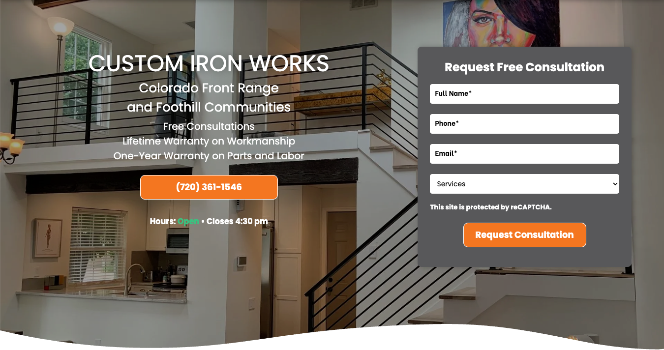
Superhero
- The
Superhero is a variation of the Standard Hero designed to support on-page conversions through a simple, built-in form.
It consists of one row with two columns — text and conversion content on the left, and a form on the right. - Used on the homepage, category landing pages (CATs), and core service pages.
- Occupies the full width of the page and displays a static, high-quality background image. Hibu One SmartSites do not support or permit hero videos, sliders, or animated content of any kind.
- Structure
- Left Column – Contains the headline (H1), geo, motivating factors, CTA button(s), and, when relevant, an open/closed hours widget.
- H1s inherit global font styles; Build may manually adjust size or color for readability.
- Right Column – Contains the Hero Form, designed to capture quick leads.
- The form must remain in the right column. The text and form positions may not be switched under any circumstance.
- The Superhero layout follows the same overall design and visual principles as the Standard Hero, but with additional constraints to reduce clutter and keep the visitor focused on conversion.
- Design and Content Rules
- All Standard Hero rules also apply to the Superhero:
- Full-width, static background image
- No other interactive elements (e.g., video, slider, animation) may appear within the Superhero
- Only one hero per page.
- Content and form positions are fixed — text on the left, form on the right. This is a hard rule.
- Additional Superhero-specific limitations:
- Only one CTA button is allowed in the left column to minimize distraction.
- Up to two trust icons may appear directly below the CTA, if requested.
- Icons should reinforce credibility (e.g., BBB Accredited, Licensed & Insured) without drawing attention away from the form.
- The background image and overlay must meet all readability and quality standards defined for heroes.
- Superheroes are not appropriate for all business types.
- Writers and QA must carefully evaluate whether a form makes sense for the client’s industry and audience.
- Restaurants, retail stores, and some professional service providers typically do not include a form in the hero.
- Forms may be appropriate for service-based or inquiry-driven businesses (e.g., HVAC, roofing, landscaping, legal consultations).
- If a form is requested for a business type that doesn’t normally use one — for example, a car wash or a restaurant homepage — the writer or QA must pause and confirm with the client or Account Manager before including it.
- Example: “Are you sure this car wash wants a ‘Request Callback’ form in their hero?”
Thin Hero (Utility Pages)
- Thin heroes are used on
utility pages—pages built for quick reference or navigation, not for direct conversion or lead generation.
- A Thin Hero presents only essential information. It visually identifies the page without including any calls to action or engagement elements.
- Content Requirements:
- Headline (H1): The page name (e.g., About Us, Contact Us, FAQ, Reviews, Blog, Gallery, Request Appointment, Careers, Finance, Calendar, eCommerce, Patient Forms).
- H1s inherit global font styles; Build may manually adjust size or color for readability.
- Subhead: Business Name (NOB).
- Design: Solid color or a simple two-color gradient background.
- Exclusions: No motivating statements, CTAs, open/closed hours, or forms.
- Design Rules:
- Headline and NOB must be left-aligned.
- Text shadow is on by default but should be toggled off if visibly intrusive.
- Use background colors from the approved site palette—avoid matching the navigation bar color exactly.
- Apply consistent spacing and sizing for visual balance across all utility pages.


Typography & Spacing
- H1s inherit global font styles; Build may manually adjust size or color for readability.
- Artists are responsible for logical line breaks (“breaking for sense”).
- Keep important phrases together.
- Break after punctuation.
- Keep names, locations, and city/state pairs intact.
- Centered headlines must pair with centered text; avoid mixing alignments.
- Adjust button color for proper contrast against the background.
- Reduce top/bottom padding if text makes the hero excessively tall.
Navigation
Overview
Every Hibu One Smart Site includes a standardized header navigation placed above the hero section. The
Navigation Links widget displays all top-level pages set to “Show in Navigation.” Designers may customize which pages appear, but must maintain the approved structure and behavior defined at the template and section level.
Well-structured navigation helps users quickly locate key pages, improves overall usability, and supports accessibility and conversion goals.
Header Navigation (Desktop)
- Design Consistency & State Behavior
- Automatically added to every site header.
- Displays all tier 1 level page that are set to “Show in Navigation.”
- Appears above the hero section within the header.
- Design & Alignment
- Navigation alignment, link spacing, and orientation are controlled through the Design Panel.
- Font, background, and hover states are linked to theme color placeholders:
-
10 – Navigation BG -
11 – Navigation Text - Divider styles may be used for separation but should remain subtle.
- Navigation item direction and alignment apply to links within the widget, not the widget’s placement itself.
- Accessibility & Legibility
- All navigation text must meet minimum contrast standards (AA or AAA) for readability.
- Maintain consistent link spacing for clean, predictable click/tap areas.
- Avoid excessive hover animations or effects that reduce clarity.
- Subpage Links
- Subpage text and hover colors follow the same theme placeholders.
- Designers may adjust spacing and background shading for clarity but must retain visual consistency with the main navigation.
Typography & Spacing
- H1s inherit global font styles; Build may manually adjust size or color for readability.
- Artists are responsible for logical line breaks (“breaking for sense”).
- Keep important phrases together.
- Break after punctuation.
- Keep names, locations, and city/state pairs intact.
- Centered headlines must pair with centered text; avoid mixing alignments.
- Adjust button color for proper contrast against the background.
- Reduce top/bottom padding if text makes the hero excessively tall.