Hero (Standard, Form & Thin Heroes)
Hero (Standard, Form & Thin Heroes)
Effective Date: February 1, 2026
Last Updated: March 9, 2026
Hibu Policy
The hero is the primary visual and messaging area at the top of a webpage and is the first element visitors see before scrolling. In a Hibu One Smart Site, hero sections follow a controlled structure designed to maintain readability, performance, and consistent conversion behavior across all sites. Each page supports one hero section only, using one of the approved hero layouts defined in this guideline.
Heroes may appear on the following page types:
- Homepage
- Category Landing Pages (CATs)
- Core Service Pages
- Service Area Pages
- Geo Pages
- Utility Pages (Thin Hero only)
Each hero combines structured elements including:
- Headline (H1)
- Geographic reference
- Motivating factors
- One or more calls to action (CTAs)
- Optional open/closed hours widget
- Full-width background image
Interactive or experimental hero layouts are not supported. Hibu One Smart Sites
do not permit sliders, animated hero banners, or non-standard hero structures.
Additional Locations: At-a-Glance
| Hero Type | Where Used | Key Elements | Optional Elements | Notes |
|---|---|---|---|---|
| Standard Hero | Homepage, CAT pages, Core Service pages | H1, Geo reference, Motivating Factors, CTA buttons, background image | Open/Closed widget, trust icons | Default hero used across most pages |
| Hero with Form | Homepage, CAT pages, Core Service pages | H1, Geo reference, Motivating Factors, lead capture form | Inline video, coupon, promotional image (replacing form module) | Use pre-built hero section when adding or removing a form |
| Thin Hero | Utility pages | Page title (H1), optional business name | Gradient or color background | No CTAs, motivating factors, or forms |
Definition
A hero is the large visual banner positioned at the top of a page. It introduces the business or service, confirms relevance for the visitor, and presents the primary action the visitor should take.
The hero supports three core goals:
- Immediately clarify the business and service offered
- Establish credibility through strong visuals and messaging
- Encourage visitors to take action through calls to action or lead capture
The hero system includes the following layouts:
- Standard Hero
- Hero with Form
- Thin Hero
Each layout supports different page purposes while maintaining consistent messaging structure and readability.


Hero Rules
The following rules apply across all hero types unless otherwise specified.
- One Hero Per Page
- Each page supports a single hero section only.
- Stacked heroes, multiple banners, or additional hero-style sections above the fold are not supported.
Static Background Required
- Heroes use a full-width background image or gradient.
- Background images must meet Hibu image sizing standards to maintain clarity across desktop, tablet, and mobile breakpoints.
- For detailed specifications, see Image Size Guidelines.
Sliders and Animated Heroes Are Not Permitted
Hero sections may not contain:
- image sliders
- rotating banners
- animated hero graphics
- carousels
These elements reduce readability and negatively affect performance and conversion behavior.
CTA Limits
Standard hero layouts support up to two CTA buttons.
Examples include:
- Call
- Visit Us
- Request Estimate
Additional CTAs are not permitted because they dilute conversion focus.
For button behavior and styling rules, see
Buttons.
Trust Indicators
When appropriate, up to three trust icons may appear beneath the CTA buttons.
Examples include:
- Licensed & Insured
- BBB Accredited
- Years of Experience
Trust icons should reinforce credibility without drawing attention away from the primary call to action.

Hero Layout Variations
In addition to the default centered hero layout, Hibu One Smart Sites support several controlled layout variations when needed to improve readability or accommodate client imagery.
These variations maintain the same hero messaging structure while adjusting alignment or composition.
Available layout variations include:
- Left-aligned hero text
- Offset hero layout
- Hero with form
These layouts are available through
pre-built sections located in the Hero / Section Hero library and should not be recreated manually.
Left-Aligned Hero Text
Hero text is centered by default.
However, when the composition of the background image improves readability or visual balance, hero text may be left-aligned.
Left alignment is typically used when the primary subject of the image occupies one side of the frame and the hero content can be placed on the opposite side without obstructing the visual.
When left alignment is used, all hero elements must remain consistently aligned, including:
- headline (H1)
- geographic reference
- motivating factors
- CTA buttons
Mixed alignment within the hero should be avoided.
This layout is available through
pre-built hero sections within the Hero / Section Hero library.

Offset Hero Layout
In certain cases, the hero may use an offset layout that separates the hero content and the image into two distinct areas.
In this layout, the hero text appears inside its own content panel while the image occupies the adjacent space.
This layout may be used when:
- the client image contains important visual content that should not be covered by text
- the image includes promotional graphics or embedded text
- key visual subjects such as people, vehicles, or equipment must remain unobstructed
The offset layout improves readability while preserving the integrity of the image.
The hero must still include the required elements:
- headline (H1)
- geographic reference
- motivating factors
- CTA buttons
Offset heroes should be implemented using the
pre-built sections located in the Hero / Section Hero library.

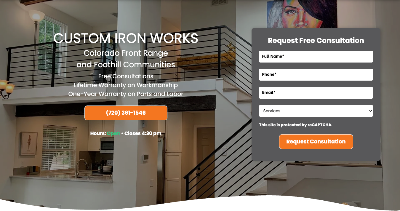
Hero with Form
Some hero layouts include a lead-capture form positioned within the hero area to allow visitors to submit quick inquiries directly from the page.
Hero forms follow strict limits on the number and type of fields to maintain strong conversion performance and ensure usability on mobile devices.
Learn more about
Hero Form requirements and specifications.
Hero with Form
Some hero layouts include a lead capture form positioned within the hero area to capture quick inquiries directly from the page.
Hero forms follow strict limits on the number and type of fields in order to maintain strong conversion performance and mobile usability.
In certain cases, the form module may be replaced with alternate content elements, including:
- an inline video
- a Hibu coupon or promotional offer
- a client-supplied promotional image
Replacement content must fit within the existing form module area and may not alter the overall hero layout structure.
Images used in place of the form should be appropriately sized to fit the module area and ideally appear in a square or near-square format.
Replacement content must preserve the readability of the hero headline, motivating factors, and primary calls to action.


Implementation Note
If a form needs to be added to an existing hero, designers should use a pre-built hero section that includes a form rather than attempting to construct the layout manually.
Similarly, if a form is removed from an existing hero, it is recommended that the hero be replaced with a
pre-built standard hero section rather than simply deleting the form column.
All hero-with-form layouts are available in the
Hero / Section Hero library.
For full form requirements, see
Hero Form.
Related Hero Component Rules
Several hero elements are governed by dedicated Hibu One guidelines. These rules apply to hero content but are maintained separately to avoid duplicating documentation.
Background Hero Video
Hero sections may support a background video within the VideoHero layout. Background video appears behind hero content and must remain subtle to avoid interfering with readability or calls to action.
Background hero video displays only on
desktop and tablet devices. Mobile devices display a static hero image instead.
For full requirements, see
Background Hero Video.
GEO Display Rules
Geographic references appearing in the hero must follow standardized formatting rules to ensure consistency between the header, hero headline, title tag, and page content.
For full requirements, see
GEO Display Rules – Header, Hero, Title, and Page Content.
Tagline Placement
Hibu does not place taglines directly beneath the logo in the website header.
When used, taglines may appear within the hero area or within supporting page content.
For full placement rules, see
Tagline Placement Standards.
Text-Heavy Promotional Images
Promotional graphics containing large amounts of embedded text are generally not suitable for hero backgrounds because the text becomes unreadable on mobile devices.
For full rules, see Text-Heavy Images and Mobile Display Rules.
Thin Hero (Utility Pages)
The Thin Hero is used only on utility pages where quick identification is needed without encouraging immediate conversion.
Examples include:
• About Us
• Contact Us
• FAQ
• Reviews
• Blog
• Careers
• Finance
• Gallery
Thin heroes contain only minimal identifying information and do not include CTAs or motivating factors.
Structure
Thin heroes contain:
Page name (H1)
Optional business name
Thin heroes may use either:
- a solid color background
- a simple two-color gradient
Hero CTAs, motivating factors, and forms are not used within Thin Hero layouts.
Typography & Spacing
Hero typography must remain clear and readable across all devices.
Designers may adjust headline styles slightly when necessary to maintain visual balance with the background image.
Designers are responsible for:
- maintaining logical line breaks
- keeping names and geographic references intact
- ensuring headline readability across breakpoints
Centered headlines should pair with centered body text. Mixed alignment should be avoided unless required by layout balance.
CTA buttons must maintain sufficient contrast against the background image.
If hero text becomes visually crowded, vertical spacing should be adjusted to preserve readability.